You’ve poured your heart and soul into developing the perfect product, and now it’s time to introduce it to the world. But how do you make your product stand out among a sea of competitors? The answer lies in crafting an irresistible sell sheet that succinctly conveys the value proposition of your product. Sell sheets and distributor decks are essential tools for CPG brands seeking to get their products on the shelves of big-box retailers.
This article will explore the key components of a winning product sell sheet, with tips and examples of sell sheets from successful companies.
What is a sell sheet? What is its purpose?
A sell sheet is a marketing tool used to promote and sell a product or service. Sell sheets are typically formatted as a one-page document with key information about a product.
The purpose of creating a sell sheet is to convince potential customers or clients to buy or invest in the products being advertised. An effective sell sheet should grab the reader’s attention and provide them with a quick, easy-to-digest overview of the product. Creating an eye-catching sheet can help to differentiate a product from its competitors by emphasizing its key features and unique benefits.
Product sell sheets should feature a clean and professional design that accurately reflects the brand and product(s) being marketed, with essential details such as product descriptions, pricing, and contact information. High-quality images, attention-grabbing copywriting, and a clear call-to-action (CTA) are all important elements in crafting a successful sales sheet. In addition to visual appeal, the language used in a sell sheet should be clear, concise, and easy to understand. The product’s unique selling points should be the focal elements of the document, and the benefits of the product should be explained in a way that is relevant to the target audience.
What elements should your sell sheet include?
Sell sheets were conceived to provide potential customers with a comprehensive overview of the product and its benefits in a single page. A winning sell sheet should include the following elements:
Logo and headlines
Do not overlook the logo when designing your sell sheet. A large, memorable logo and colors that are consistent with the brand guidelines will help make a lasting impression. The logo and headline should be prominently displayed near the top of the page and set the tone for the rest of the sell sheet. A well-designed logo and headline can help to increase brand recognition and recall.
Product descriptions
The goal of a sell sheet is to highlight the product’s key features and benefits in a clear, concise, and easy to understand manner. The description should be written with punchy copy that engages the target audience and accurately represents the product and its value. A well-written product description should attract customer interest and encourage them to take action, such as making a purchase or requesting more information.
Product imagery
High-quality, professional images are essential to making a positive first impression and accurately depict your product(s). The images should clearly show the product form factor and packaging in a size and resolution that allow them to be easily viewed on the sell sheet. The use of multiple images can also be helpful in showcasing different angles or features of the product. Images should take up 30 – 50% of the real estate on the page, as a general rule of thumb for sell sheets.
Unique selling point (USP)
At the heart of every great product sell sheet is a unique selling point: a clear and concise statement that communicates what sets your product apart from the competition and/or why customers should choose your product over others. The headline is the focal point of the sell sheet and should communicate the unique selling point (USP) in a single sentence or phrase. A strong, memorable headline can help to grab the reader’s attention and make them more interested in learning about the product. Communicate your USP as succinctly as possible: ideally as little as 3 – 5 words.
Product specs
Product specs are technical specifications and details about the product, such as its size, weight, and materials used. While this section may not be the most glamorous, it is essential to include accurate and relevant specifications that will help potential customers and partners understand the practical aspects of your product. In addition to introducing the product, sell sheets must also provide customers with a clear understanding of the product’s specifications and help them determine if the product meets their needs.
Key features and benefits
The features / benefits section of a product sell sheet should showcase the specific features of your product and explain how they directly benefit the customer. This section should be presented in a clear and easy-to-understand format, highlighting the key advantages of your product and demonstrating how it can solve the customer’s pain points. The benefits & features should tie back to the unique selling point in the headline, so the reader leaves with one key takeaway.
Pricing & ordering
No sell sheet is complete without pricing & order details: any important information that a customer needs to know in order to make a purchase, such as pricing, availability, and shipping information. These details should be clearly presented on the sell sheet, along with any relevant codes such as a SKU or UPC number. Some sheets don’t include pricing, whereas others will include specific offers, discounts, or promotions (depending on the audience).
Call-to-action
A call-to-action (CTA) is a key component of every sell sheet or sales presentation. The CTA it encourages the reader to take a specific action, such as making a purchase, requesting more information, or visiting a website. A well-designed CTA can increase customer engagement and drive sales, and it should be an integral part of any sell sheet design. Examples of common CTAs include phrases such as “Order now,” “Learn more,” or “Get started.” The CTA is generally placed at the bottom of the sell sheet, so it is the last thing the audience reads.
Tips for designing a winning sell sheet
Follow these tips to design a sell sheet that will help your products stand out from the competition:
- Strong, professional imagery: High-quality, professional images are essential to making a positive first impression and accurately depicting the product. The images should be eye-catching and accurately demonstrate the product’s form and function.
- Memorable, attention-grabbing copywriting: The language used in the sell sheet should be easy to understand, attention-grabbing, and memorable. The copywriting should effectively communicate the key features and benefits of the product.
- Clear call-to-action: The call-to-action (CTA) should be clear and concise, and the language used should be compelling and action-oriented. The CTA should be placed prominently on the sell sheet and its design should be eye-catching and visually appealing.
Examples of sell sheets
Now that you understand what it takes to create a sell sheet, let’s explore a few examples of sell sheets for popular products:
Dole sell sheet
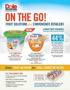
Below is an example of a sell sheet from Dole, the packaged foods manufacturer. Their sell sheet features vibrant colors and appealing images of the products. The two largest elements on this one-pager are the product images and the headline, which highlights the key benefit for consumers: “on the go!” fruit solutions.
The goal of a sell sheet is to enable the reader to grasp the key takeaway in just a glance. The Dole sell sheet demonstrates how combining attention-grabbing copy with eye-catching design is the key to communicating effectively.

CatDancer sell sheet
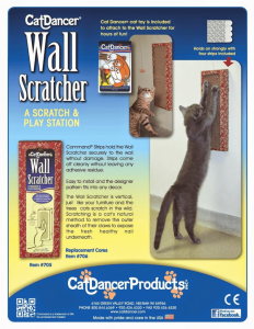
Below is a product sell sheet for a wall scratcher toy for cats, by Cat Dancer Products. This sell sheet is effective for a number of reasons, but the key to its success is the use of imagery to visually demonstrate the functionality and perks of the product. This sell sheet is customer-focused: emphasizing the benefits of the “scratch and play station,” and also providing a way for prospective clients to contact the company at the bottom of the page. This is an exemplar of how to fit all the essential details within just one page.

Need help creating your sell sheet?
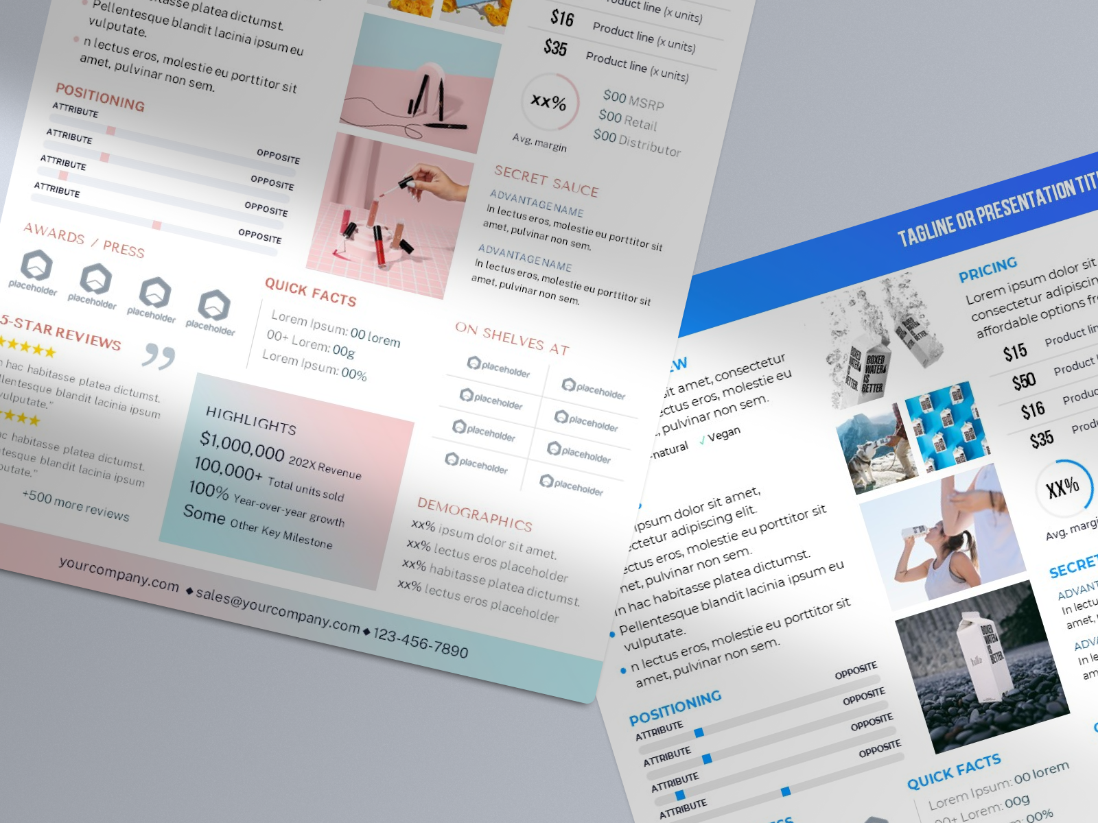
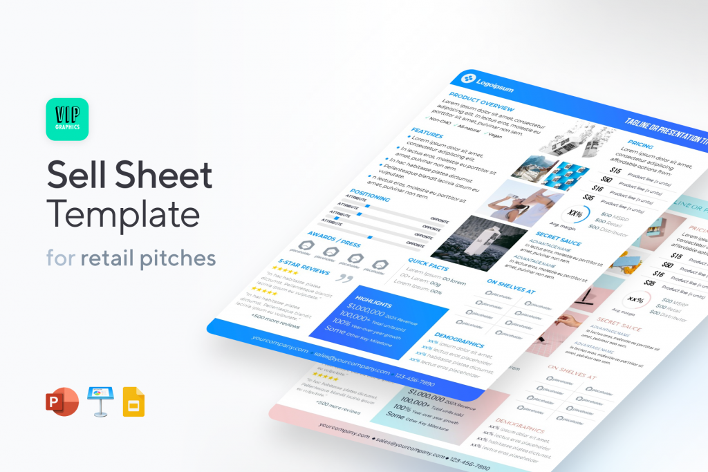
A well-designed sell sheet is an essential tool for retail brands pitching distributors and partners. You might be interested in the popular Sell Sheet Template designed by our team at VIP.graphics: a sleek and eye-catching template created by experts who have helped secure millions in deals with top retailers like Walmart, Starbucks, Target, and 7-11. Creating a professional-grade sell sheet is quick and easy with this template — check it out here.

