As an entrepreneur, learning how to give compelling presentations is of vital importance. Some presentations such as a startup pitch decks or sales proposal presentations can make or break a company’s future. The good thing is that giving a presentation is highly coachable and fairly straightforward. With practice and the right guidance, any presenter’s content and delivery can be transformed from muddled to mesmerizing.
We have compiled a list of 25 tips to help you improve your next presentation and capture your audience.
1- The First Slide Should Be the Catchiest
Capturing the attention of your audience right from the start helps you keep them engaged across the length of the presentation. To accomplish this you are going to need to come up with a catchy first slide. An engaging question, an inspiring quote, an interactive poll, humor (a funny picture, meme, or quote), an interesting fact, a bold statement, opinion, or a piece of information are some of the tools you can use to make your first slide memorable. For a good example, look to the famed Airbnb pitch deck!
2- Personalize
You cannot give people what they want if you don’t know who they are. You can personalize their presentation experience by gaining insights into their preferences and intent. As an example, if you are pitching to leads from the automotive sector, discuss the very first vehicle you bought. You can take this one step further by
3- Talk Instead of Reading
Is there anything more boring than watching someone read a text for 10 or so minutes? Never read slides as show a lack of passion on your part. The audience will respond more positively to a presentation that’s passionate. It’s impossible not to get caught up in that conviction when the audience see how excited, moved and confident you are in your talk. You should convey your ideas and use the presentation as a supplement.
4- Use Hard Data and Stats
Most presentations lie somewhere on the continuum between a report and a story. Usually, a report is comprehensive, informative, and data-rich, but it does not engage the reader. Listeners often seek facts and information as well as stories to connect with a speaker. A great presenter layers story and information as if they were a cake, and knows that each type of talk requires its own ingredients.
5- Storytelling
Stories engage the human heart, and metaphors abound for the narrative structures that are most effective for engaging people. It’s best if you use your presentation to convey a story about whatever idea or message you want to convey.
6- Use the Right Kinds of Fonts
Use the type of font that is large enough for the room and is in charge. Although you shouldn’t have any paragraphs in your presentation, the little text you have should be in a large and readable font. Some of the best fonts for presentations include Lato, Roboto, Bentham, Fira Sans, Montserrat, Open Sans, Dosis, Libre-Baskerville, and more.
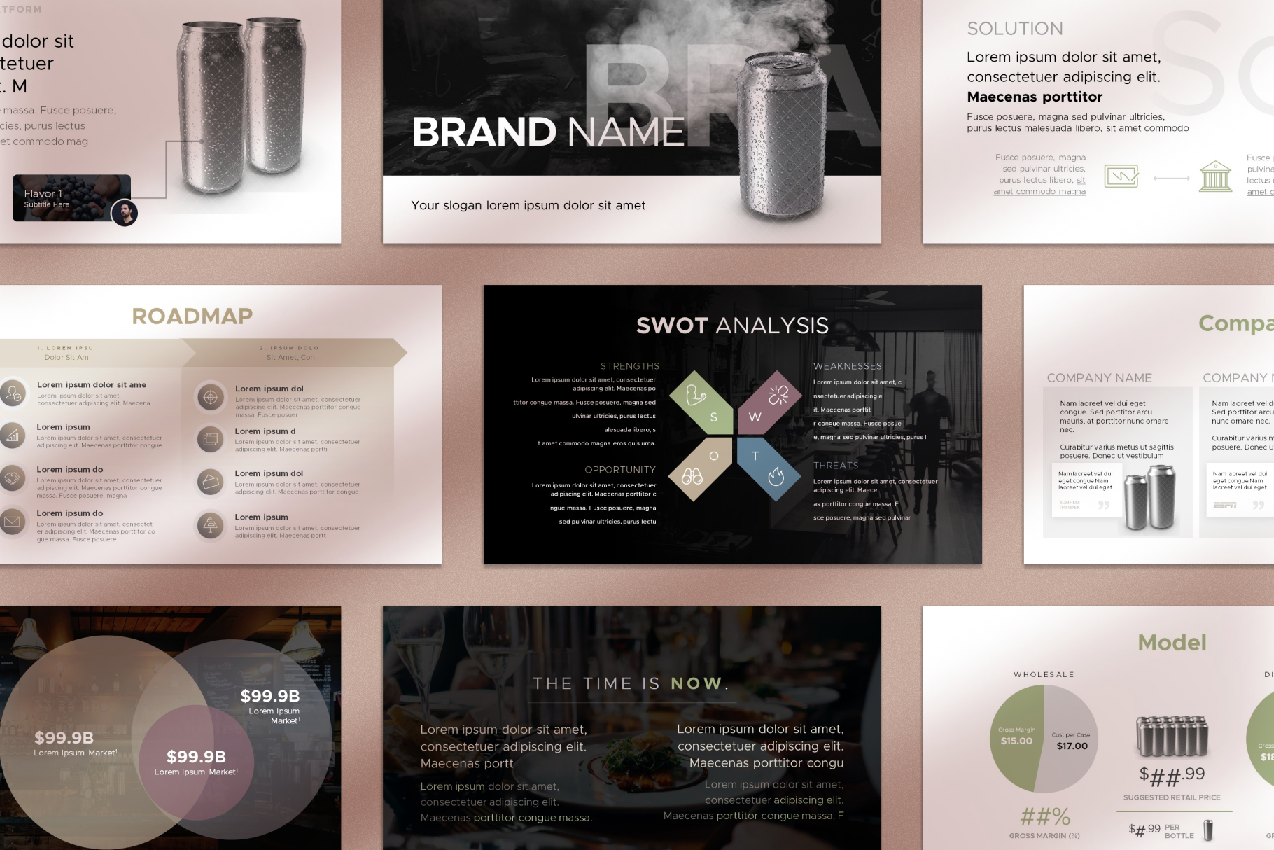
7- Professionally-Designed Templates
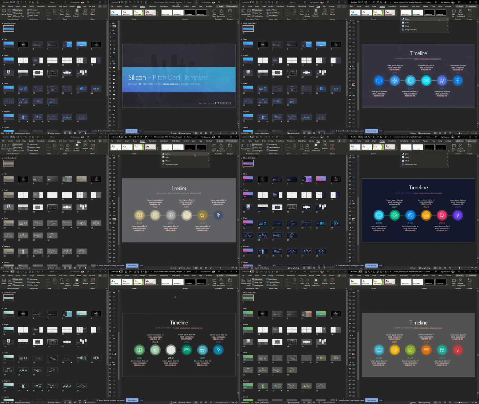
Templates can help you make presentations that are not only pleasing to the eye but also straightforward with conveying the information. For instance, the Silicon Pitch Deck Template is a feature-rich template that provides all slides in 2 schemes (light + dark) in addition to a wealth of customization options via the 8 color themes and 5 font themes included.
8- Ask a question
To prevent the audience from zoning out and for maintaining the presentation engagement, keep involving your audience by asking a question.
9- Humor
Humor can be very powerful because it evokes an emotional response and gains your audience’s trust. Embrace some humor in certain places to put the room at ease without overdoing it. A good dose of humor breaks the ice like nothing else, and can also help simplify complex or technical scenarios.
10- Use Bullet Points
It is important to highlight important points with bullet points within a presentation so that the reader can identify the key points and facts quickly. Bullet points also allow you to speak in a natural way with your audience. This goes back to the point of not reading from the presentation and talking with your audience and bullet points can help you with that by supplementing key points to discuss. That said, you should always aim to minimize the number of bullets and avoid creating “walls of text” for slides.
11- Quality, not Quantity
It’s very tempting to discuss your ideas in length because they are important to you. Similarly, when pitching your company, you might be drawn to give all the details about your business; the reality, however, is no one wants to sit through lengthy presentations. People want to digest the most important details they need to know and move on.
12- Look at Other PowerPoint Presentations
There’s nothing wrong with drawing inspiration from the presentations that have worked well for other people. For example, Airbnb Pitch Deck Template is a timeless classic and we recently gave a fresh look to it. On the same note, you should study presentations that haven’t worked out and the reasoning for their failure.
13- Make It Colorful
Color is a crucial aspect of PowerPoint presentations. You might think it won’t affect your audience’s views but it can have a significant impact on how they take in your presentation. A presentation’s appearance can be greatly impacted by the way colors interact with one another and how you use them. Ultimate Pitch Deck Template has more than 4000 unique elements and supports 1-click color changes, so you can create the most vibrant presentation possible and customize it to match your brand guidelines.
14- Look at the audience, not the screen
You want your audience to engage with you, so keep looking at them while speaking. Find a couple of friendly faces from the audience and think of them as friends you are meeting after many years and now you are presenting your ideas to them. You will accomplish more with eye contact than anything else when speaking.
15- Infographics
Information can be presented clearly, effectively, and artistically with infographics without losing the viewer’s attention. The use of visual data, charts, and statistics in infographics allow people to easily digest information. You don’t need complex illustrations for this: simple shapes & diagrams can go miles for your messaging.
16- Do a Mock Presentation First
Practicing puts your skills to use and builds them up. It can lift a dwindling performance like no other. By empowering and enabling, practice contributes to human development. Before the actual presentation, it is always a good idea to do a mock presentation and polish your speaking skills. Don’t be afraid to recruit a mock audience for the feedback!
17- Don’t Use Paragraphs
A presentation that contains too much text is a bad idea. When there is a lot of text, the focus of the audience shifts to reading texts, and the speaker zooms out of the focus. The more text you have on your slides, the more your audience is playing catch up with your words. As a rule of thumb, try to keep your text shorter than a tweet (120 characters), with no more than 30 – 50 words per slide for “keynote”-style (a-la-Steve Jobs/Apple) presentations.
18- Use Charts
The benefit of charts in presentations is that they condense important numerical metrics into a visual form. You can easily convey trends in your business or market by visually demonstrating quantitative comparisons. This is an important point because people are visual learners and a strong impact can be made on the audience by using charts. When you show an effective graph or chart, your report or presentation gains clarity and authority, whether you’re comparing sales figures or highlighting a trend.
19- Structure Your Presentation
While different presentations have different structures, almost all are typically composed of three parts: an introduction that describes the talk’s purpose and structure; a body outlining the main points; and a conclusion that summarizes and highlights the talk’s significance. Depending on the type of presentation, structure it so everything makes sense to your audience. Using an “Agenda” or “Table of Contents” slide can be a good idea for longer presentations — and always include a call-to-action!
20- Settle on a Single Theme
Theme consistency is often overlooked while creating presentations. A consistent theme is not only easy on the eyes and will make your presentation look professional, but it also has many underlying benefits. If your company has a defined branding, make sure to base your presentation on it. This will exude dependability and authority and will take your presentation to the next level. Fortunately, this is very easy with software such as PowerPoint, which includes built-in theming functionality so you can easily update all your slide styles at once.
21- Be an Entertainer
Because audiences are impatient and judgmental, you should grab their attention quickly and hold it until the very end. A good presenter must double as a good entertainer on the stage to accomplish this. There are a lot of guides available on how you can improve your stage entertainment presence.
22- Physical Presence
The physical act of standing in front of an audience can be the most difficult part of a presentation for inexperienced speakers, but people tend to overestimate its significance. What you say, what you tell, and what you do are more important in deciding whether you succeed or fail than how you stand. Nevertheless, most people make the mistake of moving their bodies too much. A person’s stage presence can be dramatically improved by keeping their lower body motionless.
23- High-Quality Images Only
As mentioned earlier, it’s important to use visual aids such as images rather than paragraphs. When you do use images, make sure to use only high-quality images. This will enhance the experience of your presentation and will make it look professional.
24- Pause More Frequently
The purpose of pauses in the presentation is to create an effect, but also to build a connection with the audience. We let our listeners process what we say when we pause at the right moments. As a result, you are able to keep your listeners engaged and make them eager to hear what’s next. The importance of pausing is also important for emphasis.
25- End on an Actionable Slide
Are there any actions or thoughts you want your audience to take after your presentation? Would you like them to take action? With a Call to Action, you tell your audience exactly what you want them to do. You can also end the presentation with an inspirational quote or vision statement to relate with your audience.

