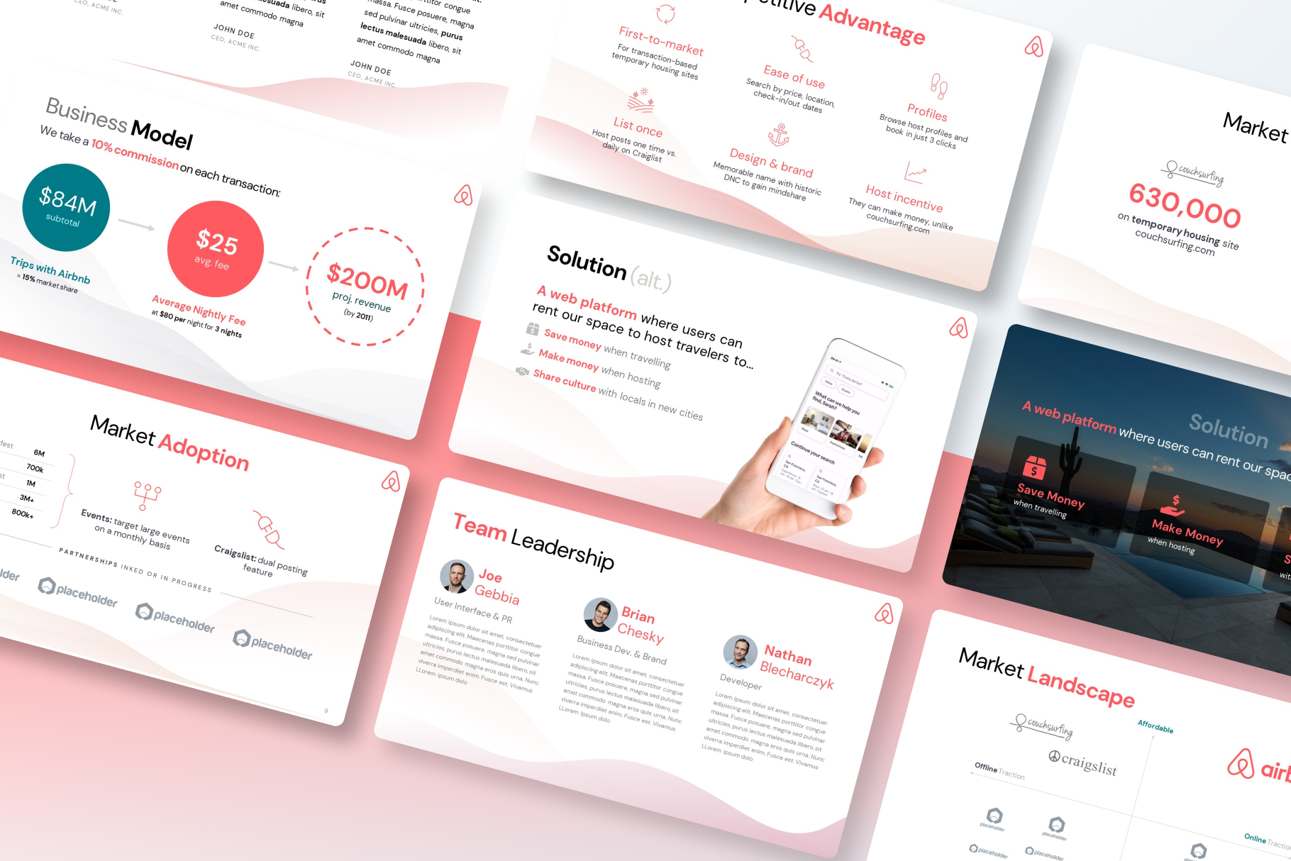
The Airbnb deck is a timeless classic in the world of startups (and no surprise, considering the founders are designers); we couldn’t resist taking a fresh pass at redesigning the slides with our most popular templates!
Follow along with the pitch teardown below, or download the abridged template for your own use: available for a limited time at JUST $2 — only for the first 50 downloads (a steal compared to the usual $20+ price tag for our professionally-crafted templates).
Perhaps the most popularly referenced and emulated decks of all time, the Airbnb deck has set the standard for thousands of startups since! Today, Airbnb is one of the most valuable private startups in the US, and a trusted community marketplace for people to list, discover, and book unique accommodations around the world.
Thousands of startup founders still refer to the Original Airbnb pitch deck from 2009 over a decade after it’s inception — the pitch deck is a confirmed classic and iconic paradigm in Silicon Valley. As a result of this pitch, Brian Chesky, Joe Gebbia, and Nathan Blecharczyk raised $600K from Sequoia Capital and Y Ventures. Since then, the company has become a giant in the travel industry, closing a $20 billion valuation round in early 2015.
These slides were recovered from a 2011 talk that Blecharczyk gave on Startup Bootcamp in Boston, and the slides demonstrate how they pitched investors for their original fundraise. The deck did an incredible job summarizing the company’s vision and the vast market opportunity they faced.
Below are all the original slides in this article along with a redesigned version using our pitch deck templates at VIP Graphics. Airbnb was born from the recognition that millions of people around the world enjoy traveling but have great trouble finding quality local accommodations. Their pitch deck exemplified how to present such a market opportunity & demand for the solution in a simple and visual manner.
What were the original slides in the Airbnb pitch deck?
The original Airbnb pitch deck from 2009 that closed their seed round from Sequoia Capital closely followed the popular storytelling guidelines from Dave McClure:
1. Cover Slide
Don’t overthink your cover: start your with the basics — your company with a logo, tagline, and perhaps the presenter. This may be more trickier than expected, as perfecting the right brand and slogan for your business can always be a challenge. Regardless, there’s no reason to complicate this slide: simply aim to explain your idea in less than 8 or 9 words, and use any visuals that may be supplementary.
2. Problem Slide
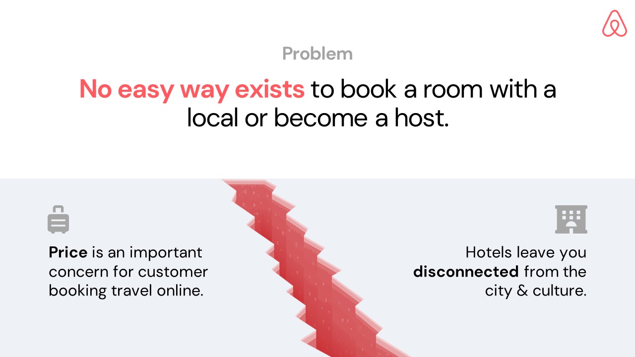
Your startup should be solving some kind of issue for industry: the first slide in most pitch decks should explain this problem. This is a good place to include relevant statistics and numbers. You can open the problem slide with an attention-grabbing piece: an anecdote, a dramatic stat or fact, or a question for the audience.
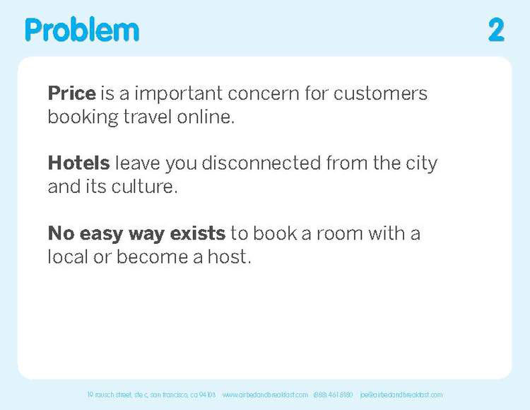
Airbnb does a great job of simplifying their problem statement to three simple lines that still ring true for the company today — over a decade later! You may also notice how they have visually highlighted the keywords with bolding to draw the reader’s eye.
A powerful problem slide should always be as clear and concise as possible. If your audience can’t understand the problem, they won’t be interested in the solution.
3. Solution Slide
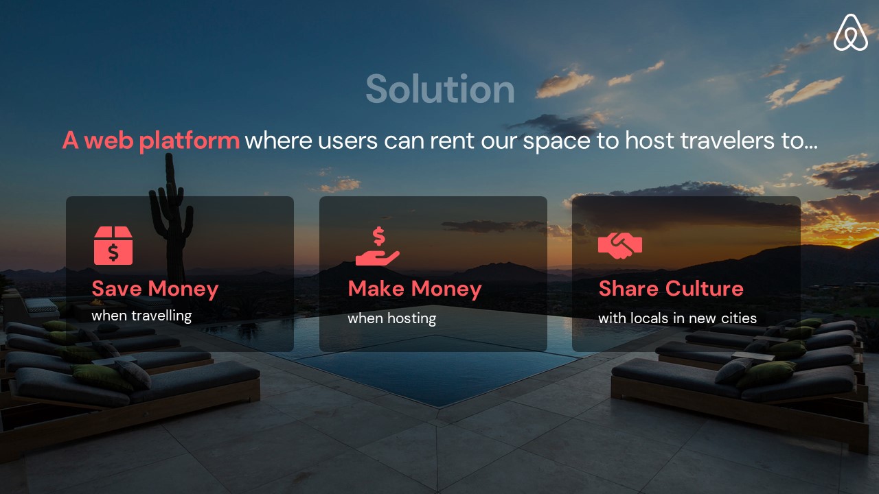
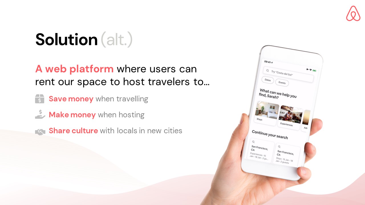
The solution slide of a pitch deck should discuss what problem(s) your product/service will help to solve, and how they will do so, as well as why your company is well-suited to deliver on those promises. This is a great place to leverage product images / screenshots and diagrams to better explain what you do.
Instead of focusing on the features of your product, this slide should highlight the value proposition in the eyes of the end user. Consider Airbnb’s example above: it simply states “save money while traveling” rather than exploring the app’s feature set — brevity is the key to any successful pitch deck.
4. Market Validation Slide
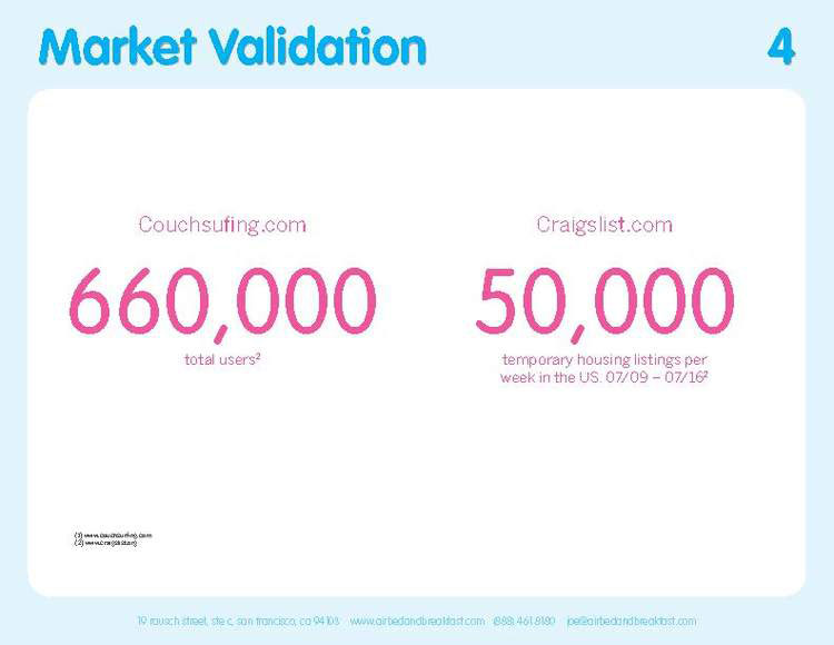
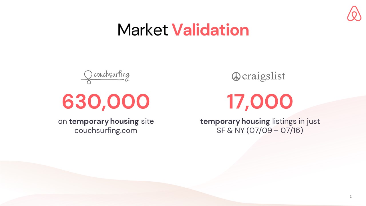
For your business to be successful, you will need to have validated the market opportunity you are targeting. Almost every promising company will have competitors or comparables — your target consumers are usually relying upon some (albeit less-efficient) means before discovering your product or services. These are the examples you want to draw upon to provide a meaningful reference for your addressable market.
For Airbnb, their market validation references were Craigslist and Couchsurfing. While Couchsurfing directly paralleled Airbnb’s services (albeit unpaid), another segment of Airbnb’s prospective users were relying upon Craigslist as a makeshift solution for “temporary housing.” Using quantitative metrics (ie. the number of listings) like Airbnb is the key to a convincing market validation argument.
In order to capture your opportunity, you should understand the current state of the market and the demand from the product’s target audience. Instead of presenting market statistics in general (which is great for the “Market Size” slide), this slide usually focuses on those that pertain to your specific offering.
5. Market Size Slide
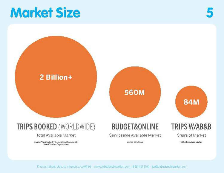
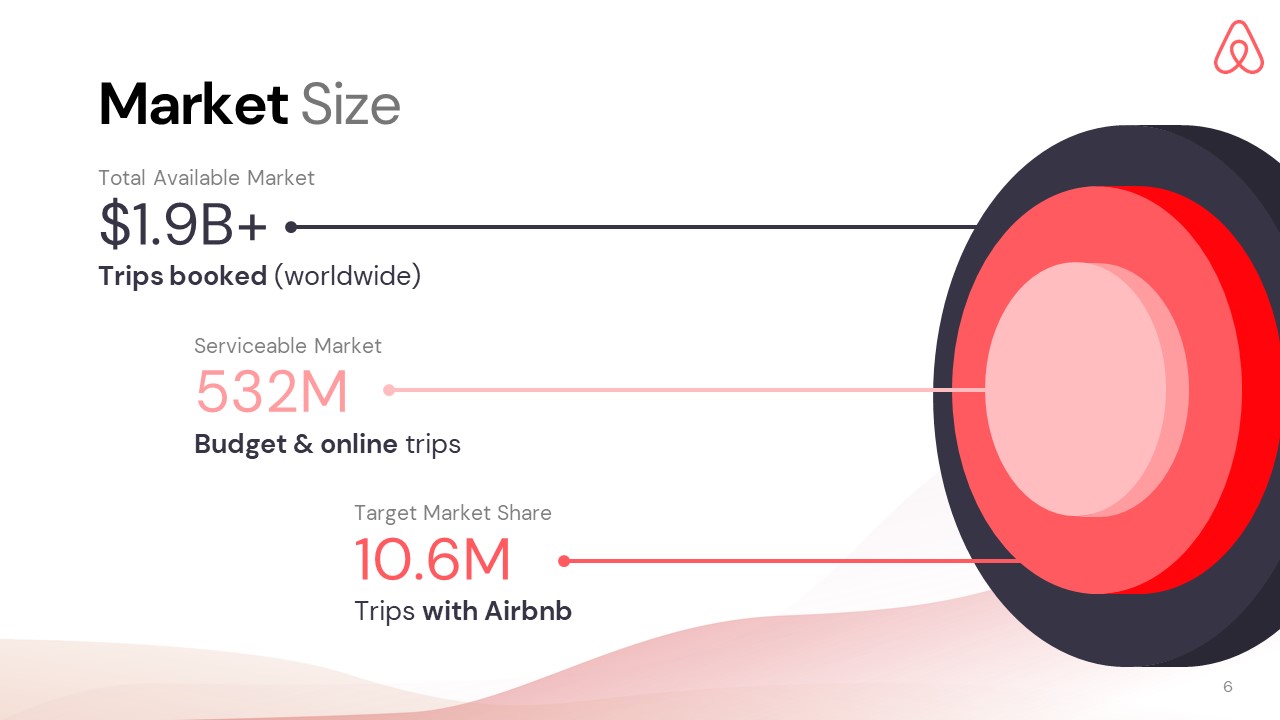
Targeting the correct segment of the market is crucial to your business’ success. It’s important to understand the market’s size, its growth, and how hard it will be to capture it. The purpose of this slide is to explain the market situation to the audience.
Ensure that you are providing market data related to your product or service and not a general overview. Ideally, you want to persuade investors that the current market is the right time to invest in your business.
Airbnb achieves this by portraying their total available and serviceable market in terms of number of trips, rather than travel industry annual revenue. It’s always good to break down your target market share vs. the total addressable market.
6. Product Slide
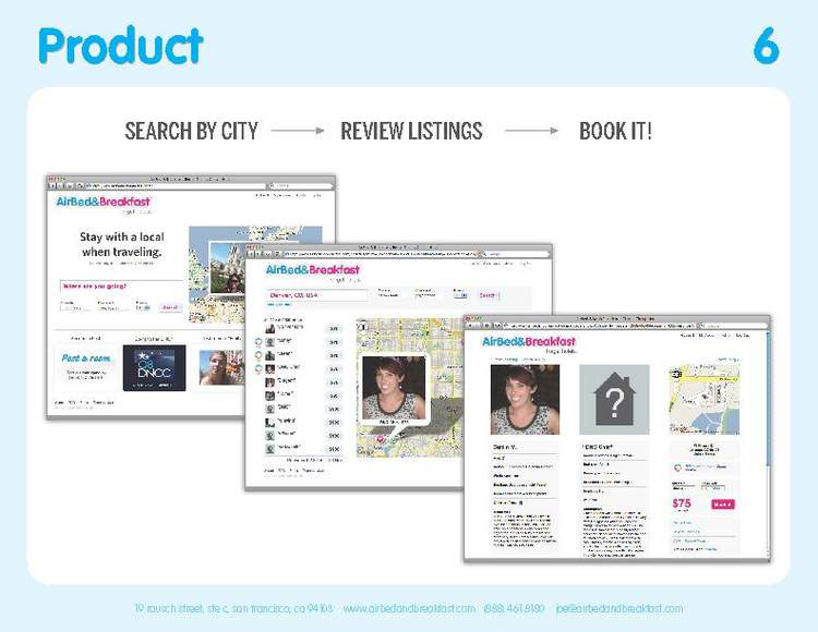
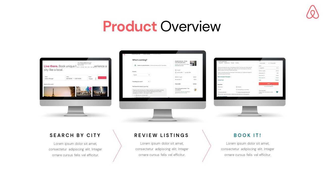
The product slide should sum up your product functionality as briefly as possible. Airbnb breaks this down into a simple three-step flow with accompanying screenshots for visual reference: 1) search, 2) browse, 3) book.
This slide should explain how your product/service will solve the problems mentioned before and why your company is best-positioned to deliver on those promises. To better explain your products, you can use product images / screenshots and diagrams here.
7. Business Model Slide
For any business, there’s nothing more important than making money for yourself and for your investors. Though you may have come up with amazing technology and a great product, investors are always looking at the potential profits.
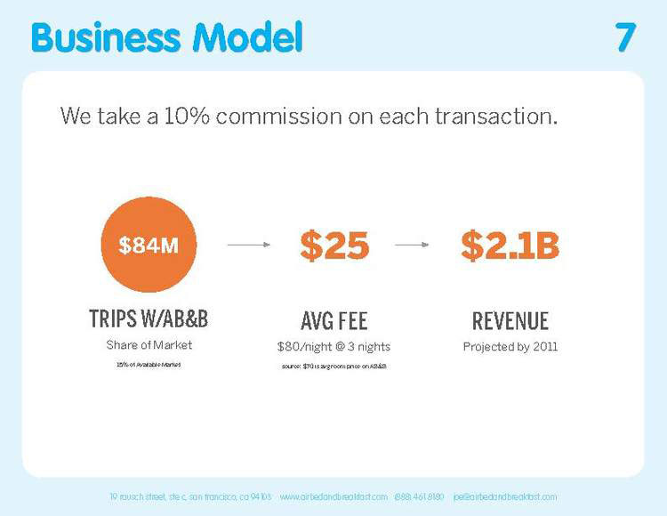
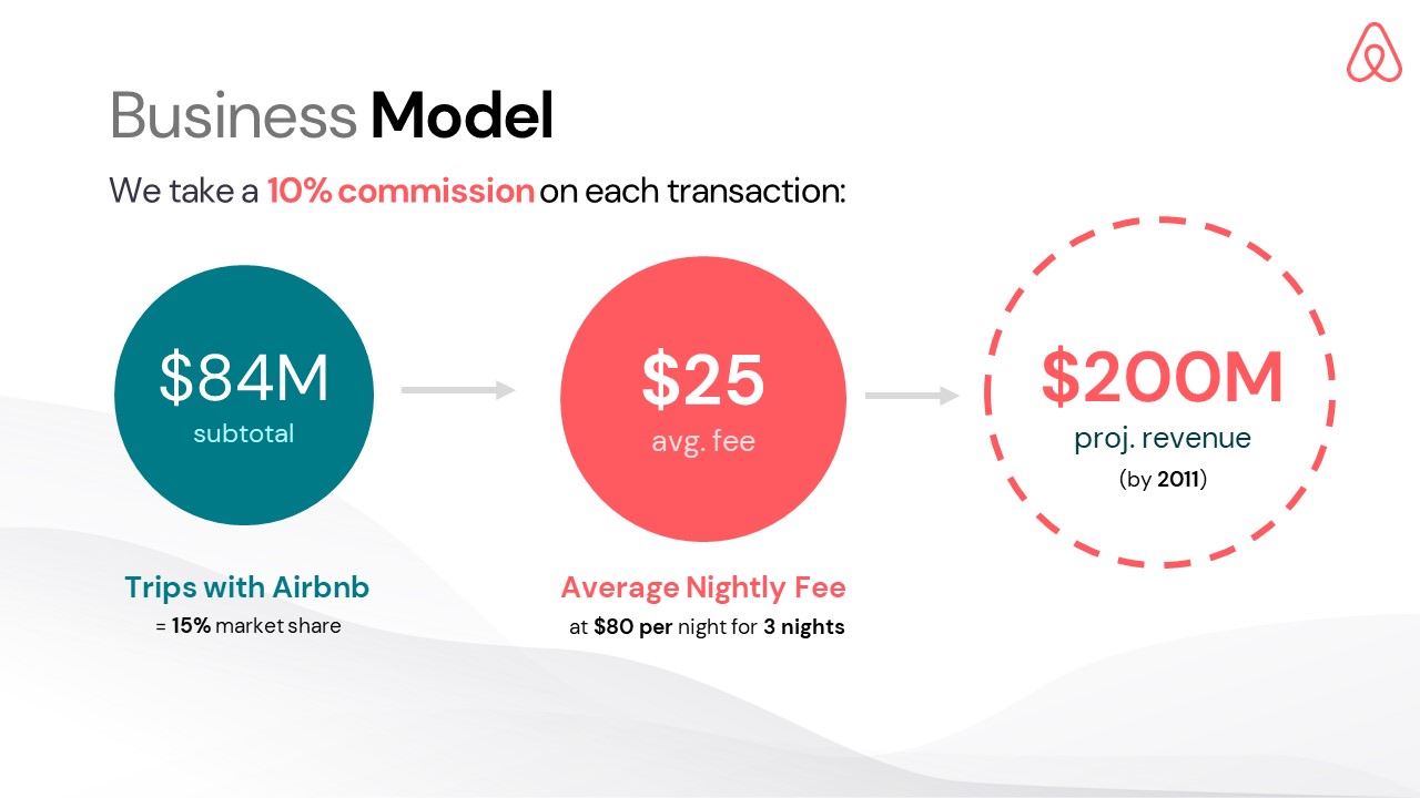
Airbnb does a great job of visually explaining their business model with a simple linear diagram — a motif they repeat later in the Investments section! Simply adding arrows to introduce a “flowchart-style” layout (like the slide above) to your slides is a great way to guide your reader’s eye and avoid intimidating with blocks of text & numbers.
The more you can simplify your business model, the better; Airbnb’s take on this slide portrays cash flow in & out in an incredibly succinct manner — a conceptual money printer!
8. Go-to-Market Slide
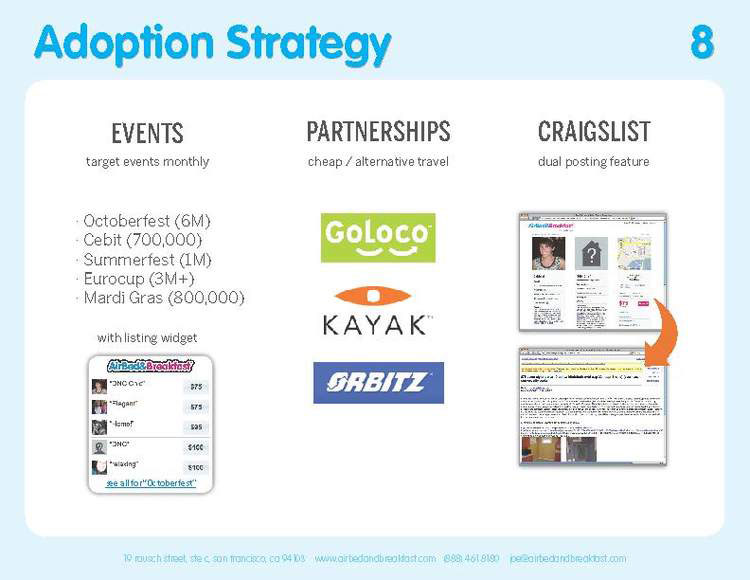
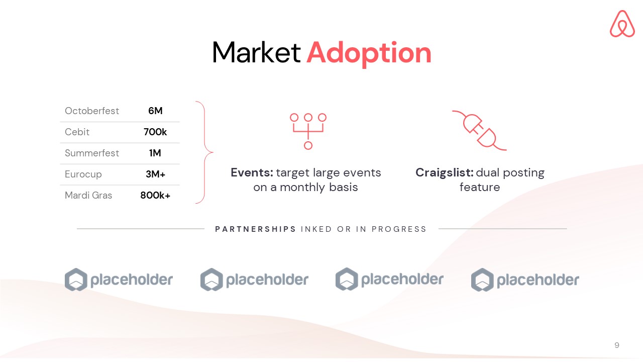
Often known as “Market Adoption” or “Customer Acquisition”, this slide should describe the key customer acquisition channels that will drive grow the company.
One of Airbnb’s key growth channels was an integration with Craigslist they called the “dual posting feature”— this slide is usually a great place startups to showcase any notable partner logos or associated quantitative metrics for traction (ie. Airbnb references headcounts for events). Whether you have established distribution or are in the early stages, you’ll want to demonstrate your awareness of the scope & scale of our growth channels.
9. Competition Slide
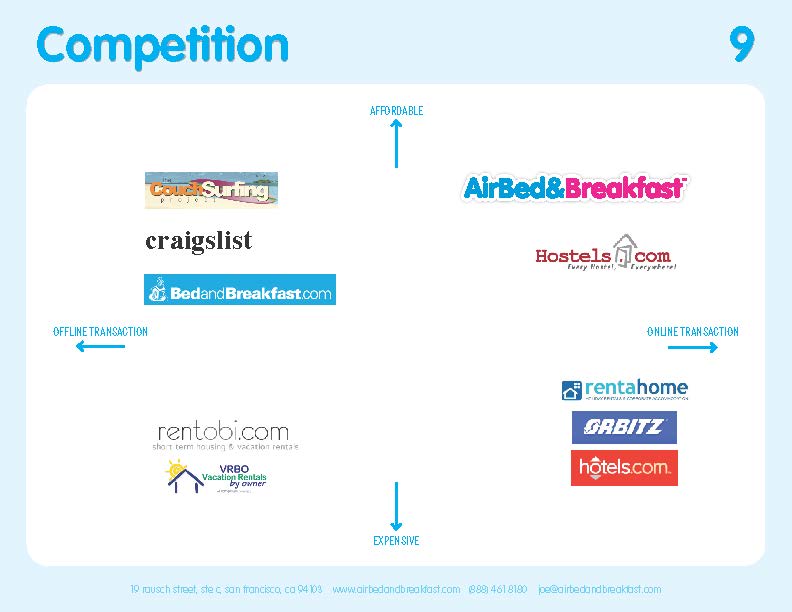
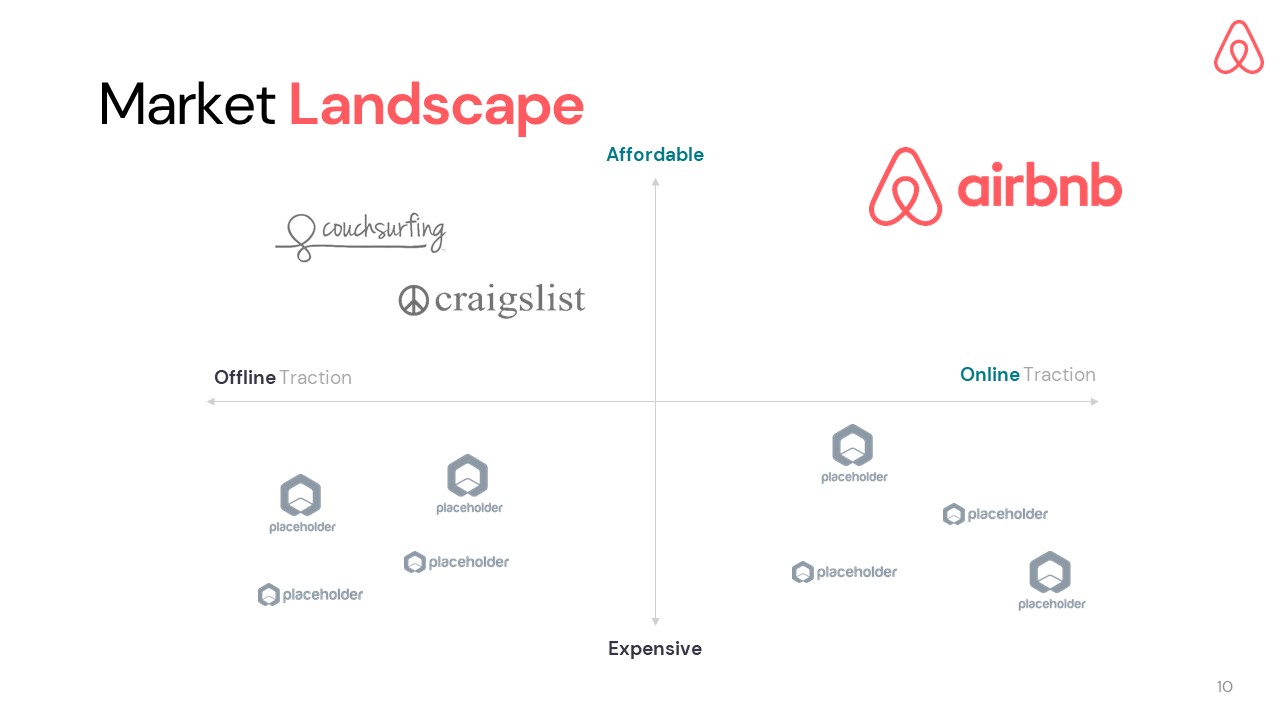
With a 4-quadrant diagram, you can clearly depict how your product/service compares to your competitors and offer a top-down overview of their full market landscape. The axes should define two key value propositions, and your logo should typically fall in the far top-right corner: Airbnb used “Affordable” and “Online” in their slide.
Another popular alternative used for competition is the feature comparison tables: a checklist intended to demonstrate your superior feature set.
10. Advantages Slide
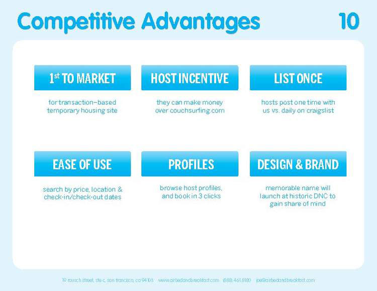
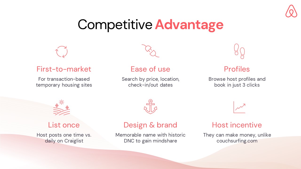
The advantage slide should explain “why you?” When brainstorming what to include here, focus on your execution advantage and why your company will win this opportunity (ie. first-to-market, unique experience or partnerships), rather than specific feature benefits of your solution for your end-users.
Airbnb makes a robust case for their positioning (and we can see how well it has panned out now): their slide highlights that Airbnb had the technology, the brand & the business model at the right time. Not much that could be improved upon from the original slide!
11. In the Press Slide
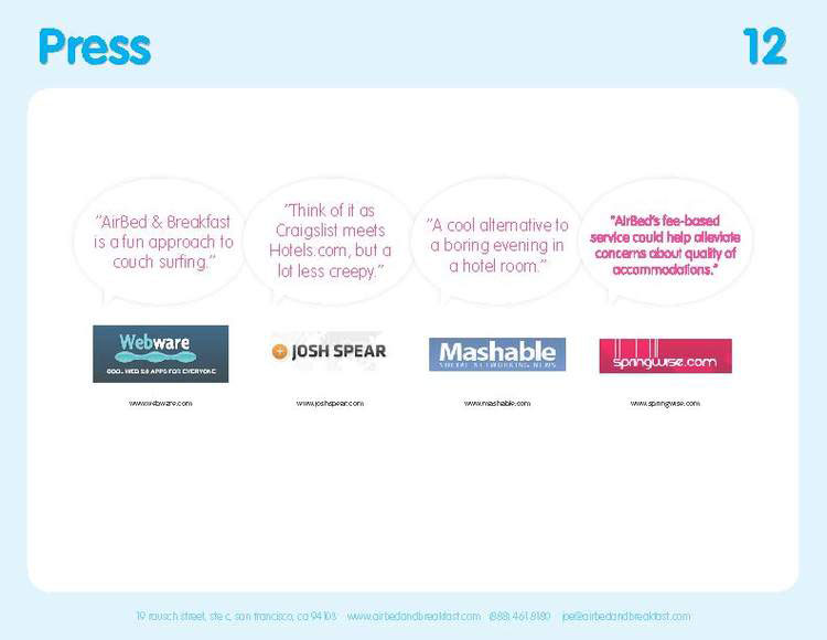
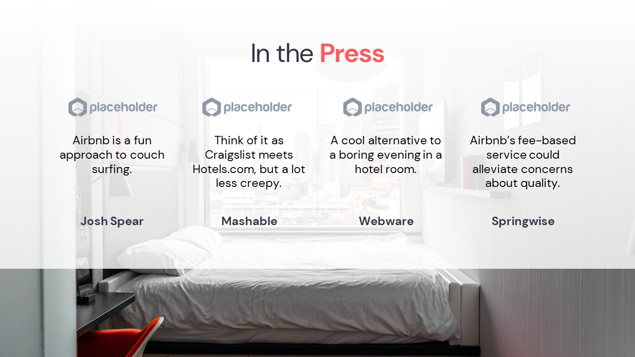
There’s perhaps no quicker way to establish your credibility than mentioning your features in notable press. Better than the classic “as featured in” logo carousel, Airbnb includes specific quotes from articles in “movie trailer” fashion.
While any savvy investors will arrive at their decision based upon various sophisticated criteria, it never hurts to hear what the media and critics think. Press mentions in prominent news media will also speak to your startup’s traction and the timeliness of the opportunity.
12. Testimonials Slide
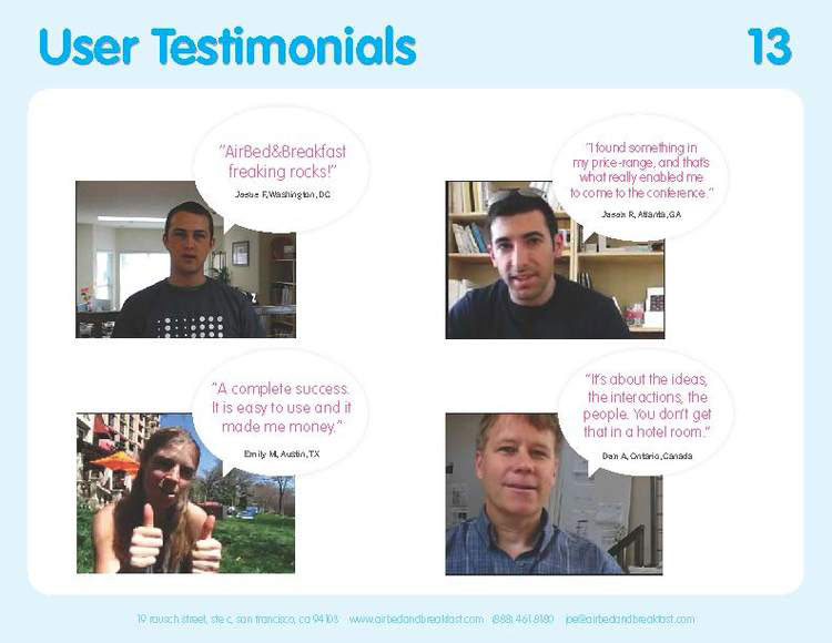
Social proof is always king — regardless of the purpose or audience of your pitch. Humans, by nature, inevitable trust and follow what other humans do, and investors are no exception tot his rule. The best way to demonstrate your product’s capabilities is with raving reviews. The original Airbnb pitch deck does just this with chat bubbles & real user photos, bringing a human touch to their pitch.
13. Team Slide
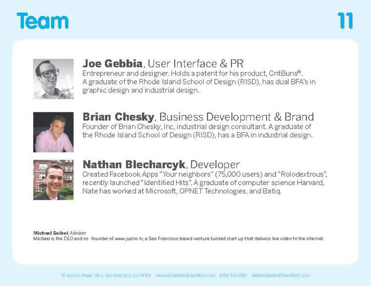
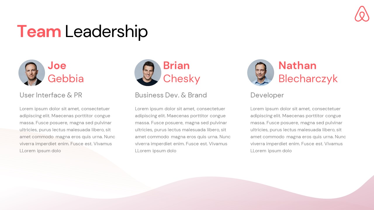
It is easy to overlook the importance of Team Slide, but it’s an important part of any investor pitch. Nevertheless, there’s no need to complicate the team slide; most are composed of the same key elements: names, titles, bios — and perhaps partner or advisor logos or headshot images. Just look to Airbnb’s example: a simple one-liner for each of the three founders. Don’t overthink it & showcase your dream team’s strengths on this slide!
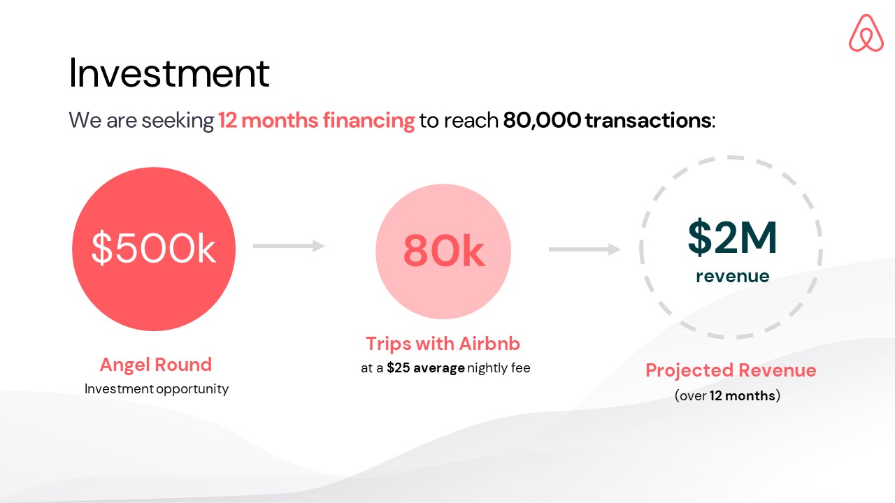
14. Investment Slide
The Ask slide is the purpose of your entire pitch, and therefore usually last. This section usually includes the target fundraise amount and the expected outcome / milestones this investment will drive, along with any pertinent details (ie. note terms, existing shareholders, board rights).
Many early-stage startups benefit from either proposing a range of valuations (to offer maximum optionality for a wide range of potential equity offers), or entirely not including a valuation on this slide.
Airbnb opted for the latter option, using a simple flow diagram to visualize how they planned to transform a $500k investment into $2M in revenue — if only every startup pitch had so simple a storyline! A convincing investment slide will include both the details of the ask & use of funds, as well as the projected return and underlying assumptions.
How-to create your own pitch deck like Airbnb
We hope you learned something from Airbnb’s pitch deck, and you are able to use these insights for your own business.
Although it probably goes without saying that having an amazing business (outside just their pitch deck) was integral to their success, it is critical in the early stages of operations to ensure your vision is portrayed correctly in order to get investors interested. That’s where crafting the right pitch deck comes into play:
If you’re interested in using this deck as a template, we’ve made this available for a limited time at JUST $2 — only for the first 50 downloads (a steal compared to the usual $20+ price tag for our professionally-crafted templates).
This presentation redesign was mostly created using the Silicon Pitch Deck template, with a few slides sourced from the Series A Startup Pitch Deck template — the exact set of 15 slides above are available for download here.
