With a $40bn valuation, Australian graphic design business Canva is one of the biggest privately-owned companies in the world. Husband and wife duo Cliff Obrecht and Melanie Perkins started the company in 2013 and now rank among the top 10 richest people in Australia.
Canva started as a tool for amateur designers & small businesses, experiencing tremendous growth in its first year: by the end of its first year, the company boasted more than 750,000 users, and famous Silicon Valley venture capitalist, Guy Kawasaki, as its chief evangelist.
Canva’s solutions have grown over time to incorporate video, presentations, websites and, most recently, live collaboration. As of today, the company has over 60 million users in 190 countries and, according to its latest financials, is on course to generate $1 billion in revenue by the end of the year.
Backed by a total of $572.6M in funding from over 16 rounds, Canva’s founders are no strangers to raising funds. Some of the largest names in the investment world have backed the company, including Sequoia Capital, Felicis Ventures, 500 Startups, and others. Canva’s pitch deck has evolved over time and contains valuable lessons for founders and entrepreneurs seeking to secure financing and create their own pitch decks:
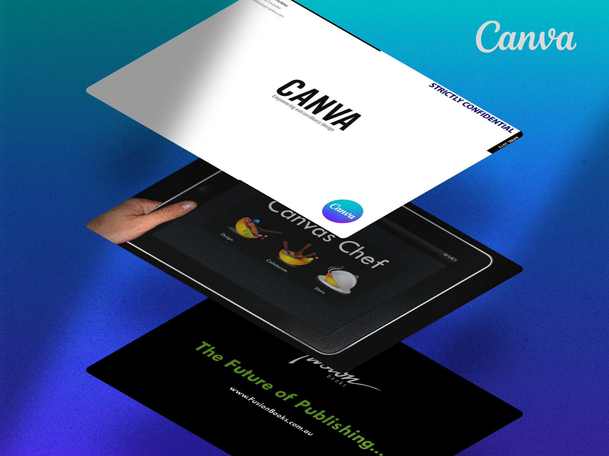
The first Canva pitch deck (Fusion Books, 2011)
Back in 2006, Melanie, a 19-year-old commerce and communications student at the University of Western Australia got frustrated with the amount of time it takes to learn most mainstream design software. She decided to try to launch an online design website that would be as easy as possible for people to use. Before going all in, she decided to test her business idea in the relatively small-scale world of school yearbooks. Thus, Fusion Books was born.
The software was an instant hit and Melanie was convinced the technology could do more than just create school yearbooks. To pursue her original dream of an easy design platform, Melanie set the course to San Francisco where she spent the next year-and-a-half pitching to various venture capitalists.
Above is the first pitch deck Melanie used; in her own words:
“[the pitch deck] was pretty terrible. I knew nothing about the norms of startup pitch decks”.
The content of the deck is not bad (it includes all the important slides such as the problem, solution, team, traction, etc.), but the execution is, as Melanie said, “pretty terrible.”
The slides have too much text, the font is often tiny & hard-to-read, and the explanations are often overcomplicated. Overall, there is just too much material that investors do not need to see right away. For example, the deck starts with nearly six slides to explain the problem, which they managed to communicate far more succinctly in the next iteration of the deck:
The second Canva pitch deck (Canvas Chef)
Fortunately, we don’t have to wait for long to get things better. The cofounders created this pitch deck while going through the business renaming phase:
“We then went through a very awkward stage when we were trying to find a business name and for a short period of time settled on the name Canvas Chef,” Melanie explained.
Apart from the new brand, this deck is a significant improvement from the first in terms of presentation design. We don’t see tiny fonts and long text blocks, and most of the irrelevant information and mind-numbing drawings are gone too.
Unfortunately, where this deck improves on design, it falls short on content. The deck focuses a great deal on the product features and user experience, and reads more like a product demo / sales presentation than an investor pitch. Unlike the first deck, this one fails to cover some of the most important topics investors expect a pitch to address, such as traction, team, and business model.
The third Canva pitch deck (Canva, 2012)
Canva’s third pitch deck marks the beginning of Canva as we know it, with sophisticated graphics, structure, and all the bells and whistles you’d expect in a modern pitch deck. Although the deck lacked some important sides in its original form, Melanie said, “Every time we’d get a really tricky question from investors we’d iterate on our deck to put the hardest questions they asked right at the front of the deck”.
Here are some of those notable additions:
Competitive Landscape Slide
All successful startups have some kind of competitive advantage over the rest of the market. This advantage can come in the form of product features, cost, positioning, distribution advantages, or expertise. Nevertheless, investors love and prefer to invest in startups that have some kind of unique competitive moat.
The purpose of the competition slide is to show investors this edge, as well as how your company compares to other market players. Insisting that you have no competitors will most likely hurt your chances of funding from investors, as it suggests you don’t know enough about the market and have no plan to beat the competition.
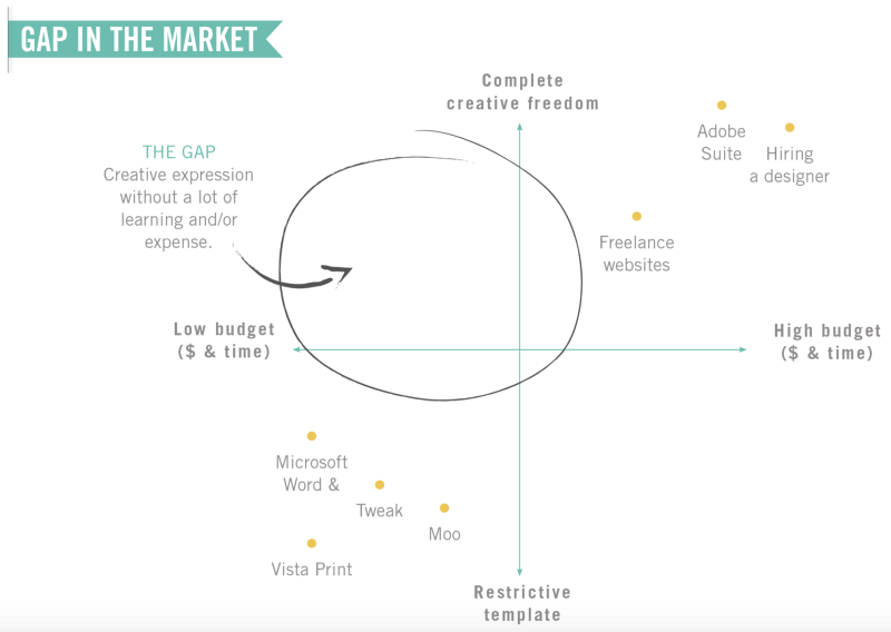
Canva’s competition slide is a great example of showing the competitive edge without overcomplicating the slide with a verbose explanation. Given that the company operates in the design industry, the slide presents the market landscape in terms of cost and creative freedom, listing other players competing in the same industry. Investors who saw this deck would have felt confident that the Canva founders had a deeper understanding of their market.
“In our early pitches they’d listen to our entire pitch and then at the end say ‘ah but that’s just the same as [some company]’. So we added this page towards the front so they’d stop asking us the same question”, said Melanie.
Market Segmentation Slide
It’s fairly common for VCs to pass on investments simply because the target market does not seem to be big enough. For a VC to generate a meaningful return on their investment, the startup generally must have at least a billion dollars of enterprise value, which means that the startup must have the potential to exit at or above $1B.
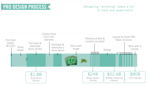
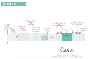
Canva’s market slide explains that “designing anything takes a lot of time and experience”. The slide has an ingenious approach to illustrating the design process while also listing the numerous sectors involved. Because Canva intends to replace all of these businesses, the total addressable market grows large enough for investors to seriously consider its potential. Commenting on the addition of the market slide, Melanie explained, “They couldn’t imagine there would be a ‘billion-dollar opportunity’ in the market, so we added this slide.” While this may have seemed like a far stretch back in 2012 (when Adobe seemed to have a chokehold on the design industry), today, Canva has realized the dream of disrupting the end-to-end design process and building a billion-dollar unicorn.
Team Slide
No matter how ambitious the vision, any startup will struggle to even get off the ground without the right people at the top. The quality of the management team has a direct impact on the fate of the firm and, ultimately, the investment. This is why investors place so much emphasis on the team and are more likely to choose a team with the deep niche-specific expertise required to implement the vision and a keen understanding of the market.
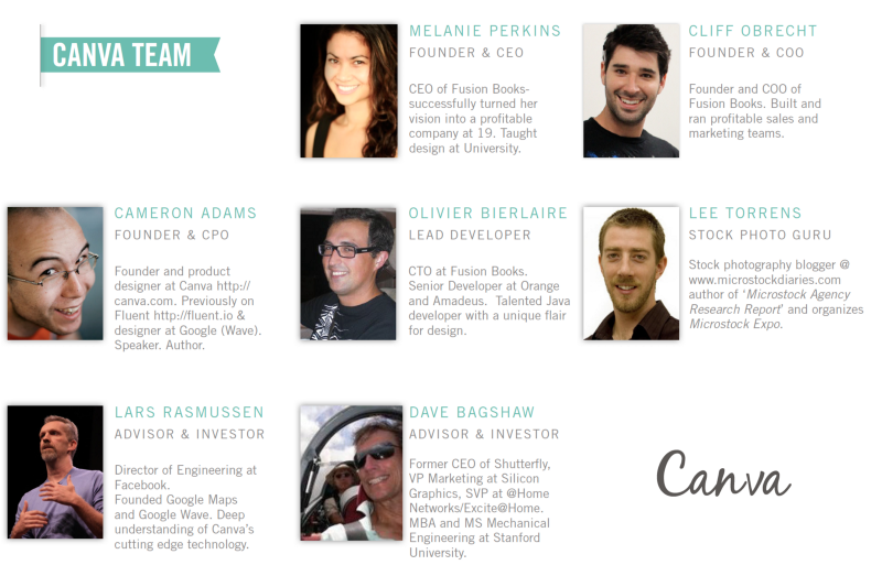
Simply put, a team slide needs to answer the question of “why is this the right team to lead this business?” To address this, the Canva deck’s team slide starts by highlighting Melanie and Cliff’s expertise in design and sales (respectively). The slide includes all the basics an investor would expect to see: headshots, names, roles/titles, areas of expertise, and previous experience.
How-to create your own pitch deck like Canva
We hope you learned something from Canva’s original pitch decks, and that you are able to use these insights for your own business. If you’d like to, you can bookmark it at bestpitchdeck.com/canva
Although it probably goes without saying that having a successful business (outside just their pitch deck) was integral to their success, it is critical for any startup to ensure your vision is portrayed properly. That’s where crafting the perfect pitch deck comes essential:
You might find our other resources on how-to create a pitch deck helpful, or benefit from using one of our expert-designed templates:
Our team has helped create decks that have closed over $100M+ in deals & funding for leading startups and even VC firms. You can leverage this experience and get a jumpstart on your pitch with one of our easy-to-use presentation templates, one-pagers, or financial models.
Creating a deck? Check out our pitch deck templates.
Every pitch requires a unique approach tailored to its audience. Our team of experts has created pitch decks for different industries, as well as funding stages:

Canva Pitch Deck Template — You might be interested in the popular Canva Pitch Deck designed by our team of experts at VIP.graphics, who have helped startups raise millions in funding. This template is fully-editable in Canva, with professional-grade slides to make your investor pitch stand out.
Accelerator Pitch Deck Template — The Accelerator Pitch Deck template was crafted for early-stage founders seeking to win funding &/or investment from pitch contests, accelerators, incubators, and angels or VC firms. Winning a pitch contest or being accepted to a prominent accelerator program requires a unique strategic approach to an investor pitch presentation.
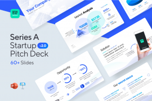
Series A Pitch Deck Template — A pitch deck template for startups and founders raising funding: Smart, actionable slides that work. This is a pitch deck template built specifically for startups, entrepreneurs and founders raising their first seed or Series A round of institutional capital.
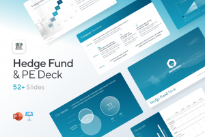
Mergers & Acquisitions Pitch Deck Template — Perfect Pitch Deck™ is a template crafted for later-stage businesses entering more sophisticated discussions such as mergers & acquisitions (M&A), late-stage investment (Series C+), or other partnerships & financing opportunities. Our team of experts created this presentation to empower founders to present with confidence to investment banks, private equity (PE) groups, and/or hedge funds (and vice versa).
Alternatively, feel free to browse our growing selection of pitch decks tailored for specific industries and businesses.
